Company
Honeywell
Honeywell Pulse
Building Management Instant Alert Apps for Mobile & Watch
Role
User Experience Architect
Period
2015-2016
Background
In a commercial building or industrial facility management, most facility managers, operators and technicians relied on workstations sitting statically in the plant rooms or remote facilities.
When there are critical issues, the system raised alarms with priorities to notify key personnel. The right people needed to receive these alarms whenever and wherever they are. The workstation did not provide these notifications. The customers relied on manual forwarding of these alarms via means such as SMS or emails.
Discover
Research
The problem of receiving alarm notifications spanned across all building management industries. It would be difficult to solve for all scenarios. We first set the verticals the project would focus on – healthcare, stadiums, leisure & entertainment, commercial, campus and industrial. This helped us narrowed down the area to conduct research.
We built shared profiles and constructed stories based on prior Voice of the Customers (VoC) insights, customer feedback and task analysis.

Building User Profiles
We built simple user profiles based on the tasks they performed. It was similar to what is well-known now as the Jobs-to-Be Done (JTBD) technique. We then created a task matrix to find the most common and valuable tasks amongst all profiles.
Storyboarding
After coming up with the initial user profiles and valuable task lists, we created comic style storyboards to share with our customers and ask for their feedback. The storyboards were also excellent tools in communicating the flows and evoking empathy externally and internally.
Define
Outcome-driven Designs
We defined our project goals via Experience Outcomes (XOs).
A traditional user story has the format of “As a (role) I want (capability), so that (receive benefits)“. It often leads to features rather than experiences.
An XO combines customer insights, competitive analysis and stakeholder ideas all into specific enablers and success criteria. It takes a general format of “As a (role), let me (enabler to perform a job) … (success criteria)“. A good XO is specific, measurable, attainable, ranked, tied to customer insights and tightly scoped. We combined our research and storyboards to form some top XOs for the Pulse app.
An example XO:
As a facility manager, notify me of important issues and critical incidents … with fewer misses and false alarms.

Develop
Iterating the Designs
Validating the Concept
The design process started with the concept of an app on mobile. The concept mirrored many things from the workstation app at the start, including features such as alarm list, alarm details and trends.
Based on shadowing and cognitive walkthrough sessions with customers, we realised that the concept did not achieve the following experiences:
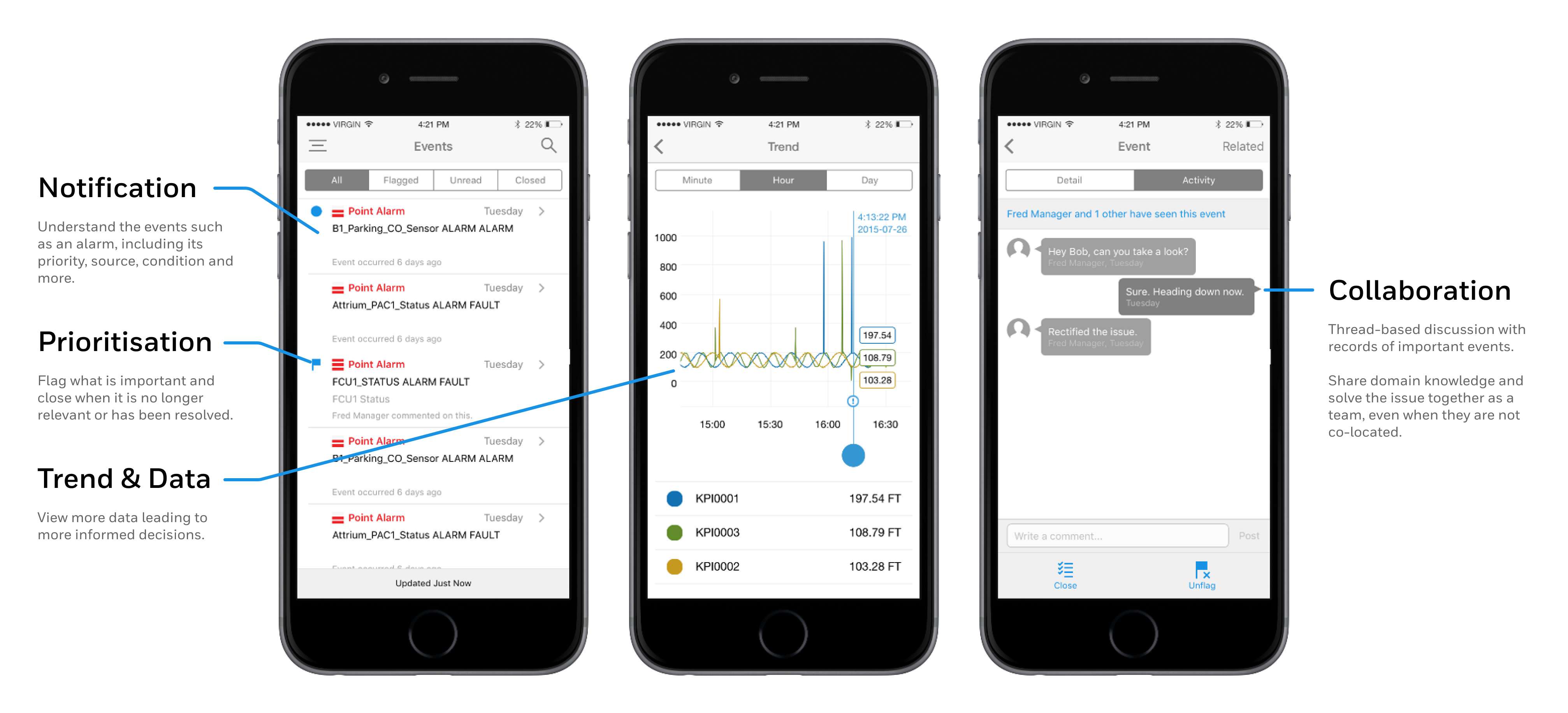
- Able to view alarms at anytime and anywhere, including situations requiring hands-free
- To collaborate with colleagues with different levels of experience and domain knowledge
- Able to keep a record of the collaborations for future references and knowledge sharing
Trialling Wearable Technology
Coincidentally, Apple just released the first version of the Apple Watch at the time. Based on our concept validation insights and this timely release, we started experimenting with wearable devices and voice controls.
The subsequent concepts explored the ideas of how other media and multi-channel workflows can achieve better outcomes.
Design
User Interface & Interaction Designs
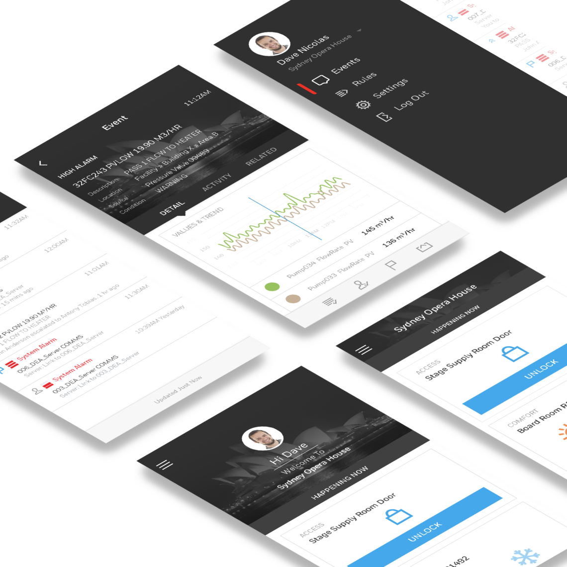
The Pulse app enabled users to receive critical alarms, such as a boiler failure, power failure, security breach or any operational issue, with essential information for decision making at any time and anywhere. It also allowed receivers to collaborate and review related alerts.
The app was available for both mobile (iOS & Android) and wearable devices (watchOS).

Immersive Design
Wearable devices were relatively new at the time. It took many iterations to design in the limited real estate and the intricate micro-interactions. It was also a moment when the team realised that wireframes were no longer satisfactory when validating and testing immersive scenarios. It was especially true for interactions such as voice and gestures.
Real-time Systems
Real-time systems also posed a great challenge for the product. Since building alarms may cause life-threatening situations, such as fire alarms, it was crucial that notifications are timely, prioritised and accurate. When there were connectivity or system issues, the users must be warned and aware.
Outcomes First
The introduction of XOs helped the organisations to focus on experiences rather than technology or features only. We started exploring wearables and voice controls to achieve the experiences defined instead of the reverse.
It also helped us to measure failures and successes. The success criteria set at the beginning helped us iterate and improve on previous designs.


Outcomes
What We Learned
The Pulse project was one of the first projects that I started using Experience Outcomes. It was also the first project that I started designing across multiple channels and devices to achieve user goals. Here were some of the learnings:
- Design for experiences instead of features.
- Real-time and real-life scenarios are complex. Prioritising based on customer values was a key to set product focuses.
- To design an immersive experience, you also need to validate and test with an immersive prototype. Interviews and low-fidelity wireframes were not enough to obtain valuable user feedback.