Company
OFX
OFX Mobile App
Rebuilding the International Money Transfer Experience
Role
User Experience Lead
Period
2016-2020
Milestones
2018 Apr Beta, 2018 Oct Launch
Background
The OFX Mobile Apps were dated iOS and Android native apps built by a third party at the end of 2016. It was a nightmare for the development team to maintain and update, yet it has a significant customer base loving its features.
The organisation wanted to rebuild the app to be a single product with a unified experience regardless of the platform and follow the mobile-first design movement.

Discover
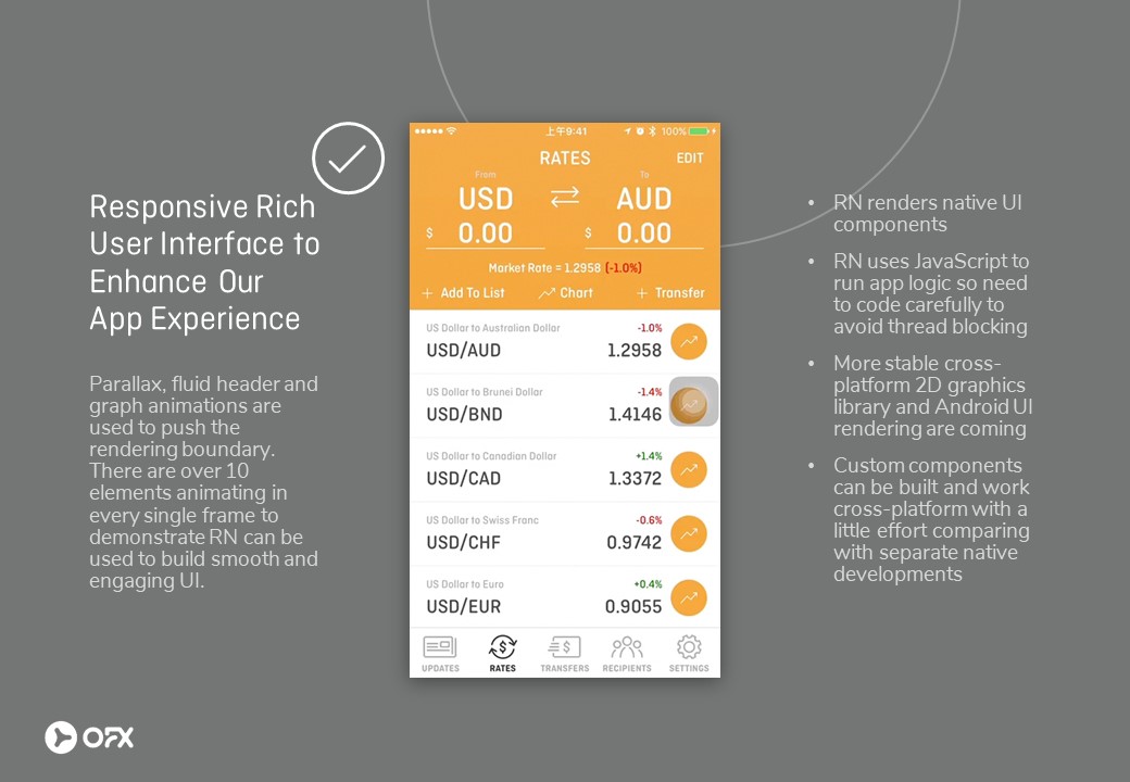
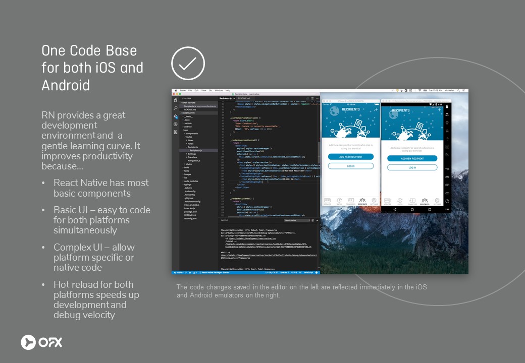
Customer & Developer Experience
The team started with only two members, a Tech Lead, and myself. We are both extremely passionate about building a stunning app that focuses on the customers while pushing the boundaries. Without many constraints, the Tech Lead and I built functional prototypes to test the limits of the technology, React Native, and established certain aspects of the team culture.
During this ideation phase, we realised one key learning. Customer experience always comes first, but developer experience is just as crucial for the longevity and continuity of the product. A five-stars app that is difficult to maintain or update will decrease its overall value to the business and lifespan.
The ability to modify code and see changes updated live for both Android and iOS was a game-changing experience for both the front-end developers and designers.
Customer experience always comes first, but developer experience is just as crucial for the longevity and continuity of the product.
Understanding Our Customers
As a UX practitioner, it is critical to conduct discovery and synthesis activities before jumping into solution designs. While designers are always keen to have more zest in the visuals, it is paramount to understand your customers and design the right things.
In addition to the business requirements, we wanted to build the new app right by tackling the right problem. We started by gathering the known customer issues within the business then started engaging existing and potential customers to understand their goals and pain points.
Discovering Goals & Pain Points
We needed to have a razor-sharp focus so we can deliver the new app and show values. We started with the first-time user experience (FTUE).
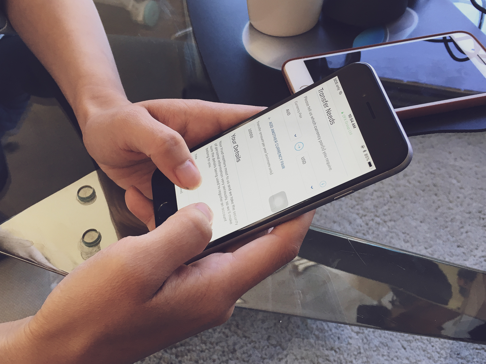
We conducted interviews and think-aloud testing with customers using an FTUE prototype containing the registration and transfer flow.
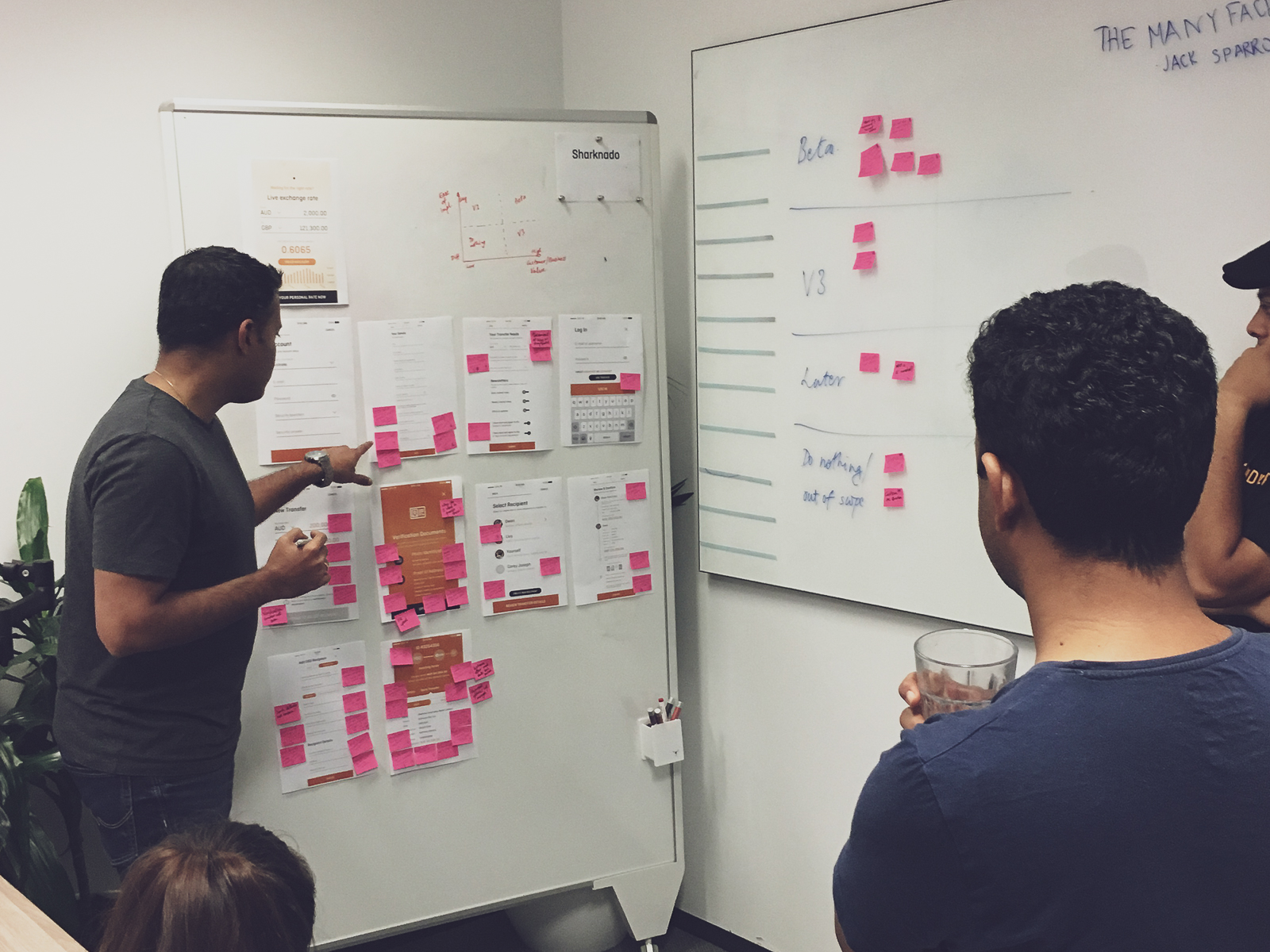
The results of the interviews and testing were analysed and prioritised via methods such as affinity clustering and bull’s-eye diagramming. These prioritised insights became the basis of our team vision, incorporating the problems we wanted to solve.
Considerations
There were other considerations based on customer base analysis. For example:
For OFX at the time, more than 50% of total revenue are from customers with age 50 or above, only 3% are from customers with age under 30. This leads to many of our key design considerations.
Our app should not be just for the young audience. Accessibility, legibility, readability, technology literacy are important UX issues with age groups above 50.
Define
Setting a Team Vision
After the key team members have joined, it was time to start designing and building based on the ideations we have. As a team, we establish the product vision.
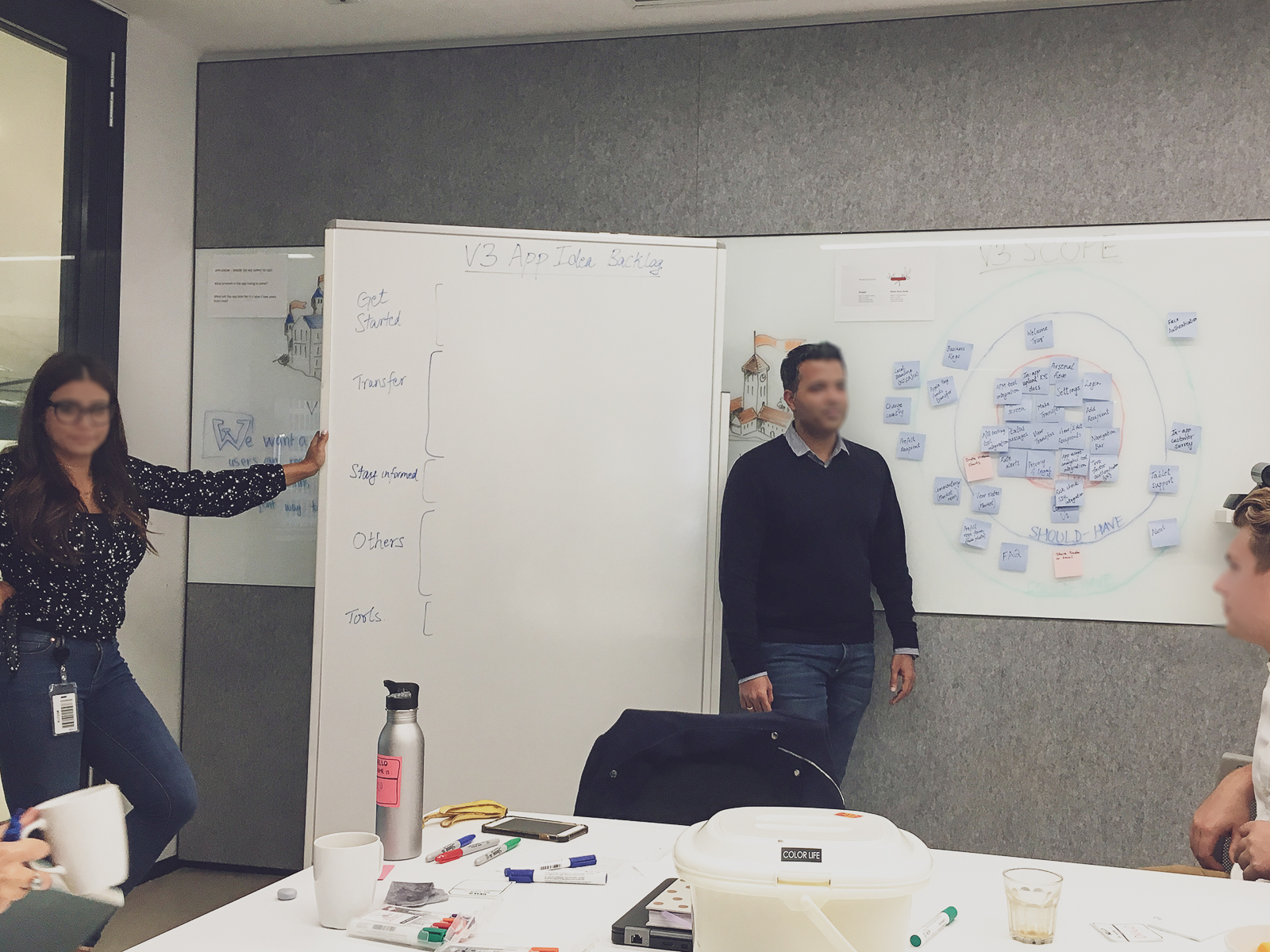
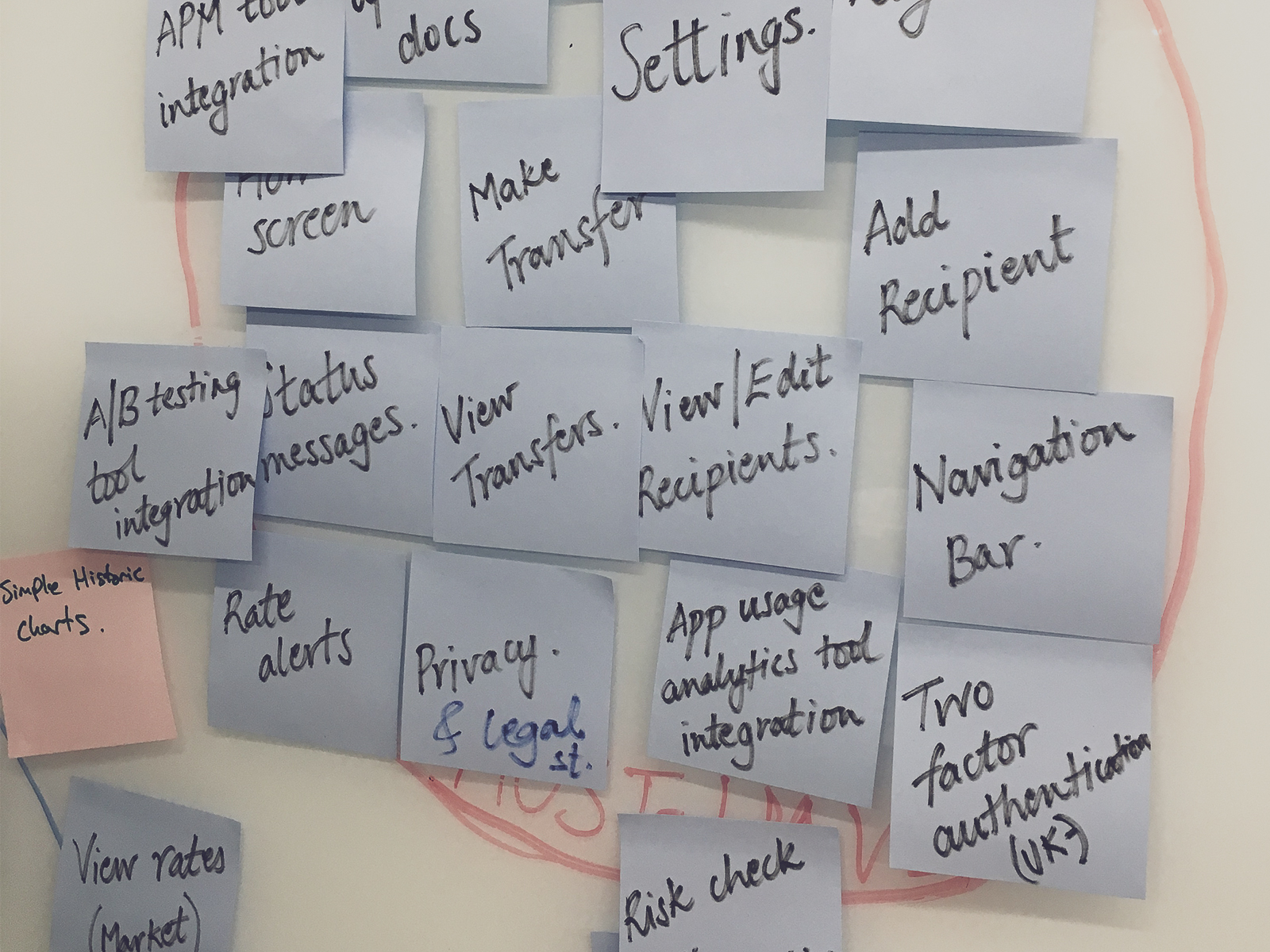
We want a one-stop shop where customers can register and make a transfer in under 10 minutes and keep themselves informed.
OFX Mobile App Vision
Instead of focusing on many features, we decided to focus on two tasks only. Whilst it may seem simple, it is essential to give our loyal customers the best experiences in what they do the most when we release a minimal lovable product.
Develop & Design
Qualitative & Quantitative Research
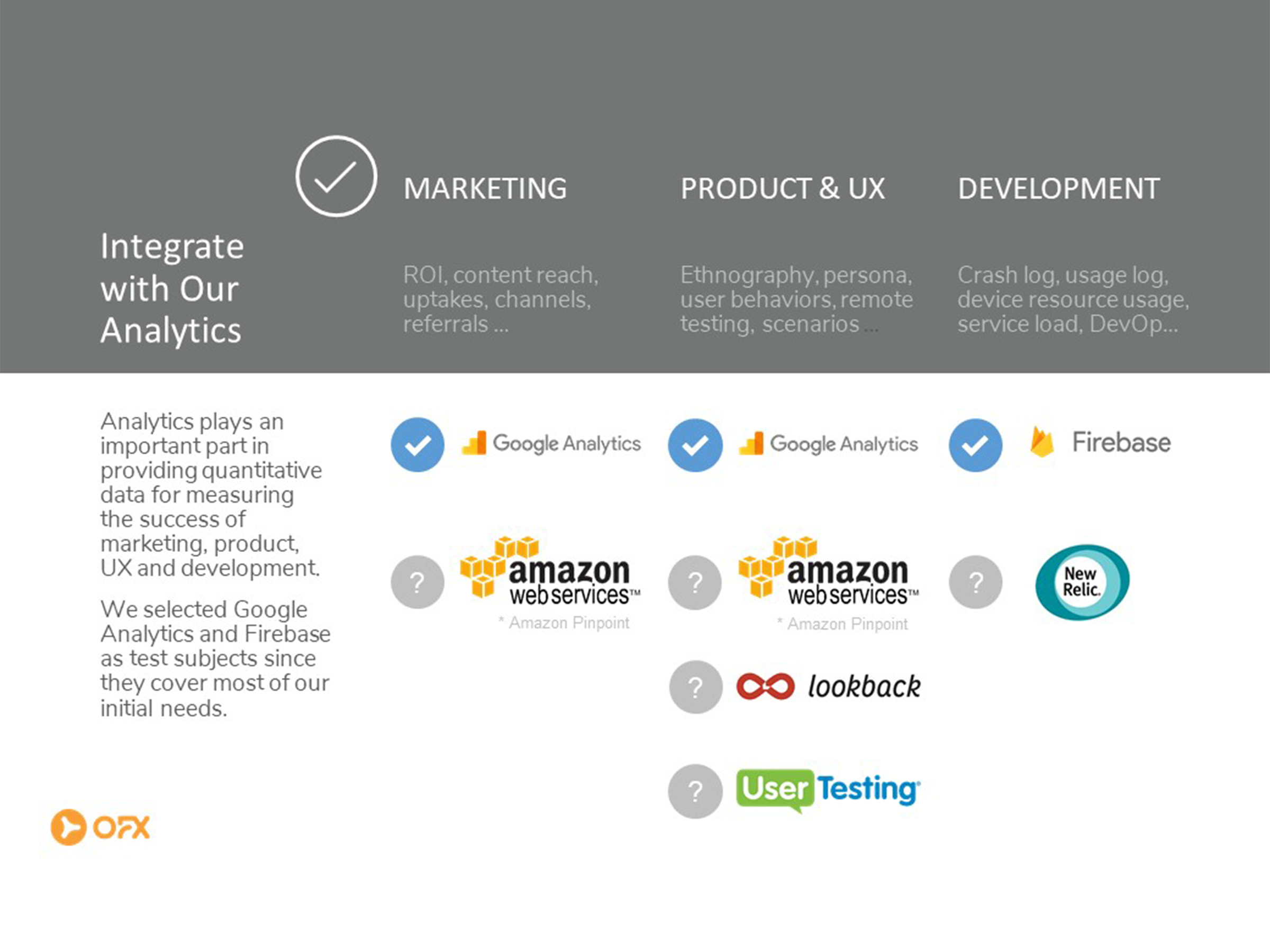
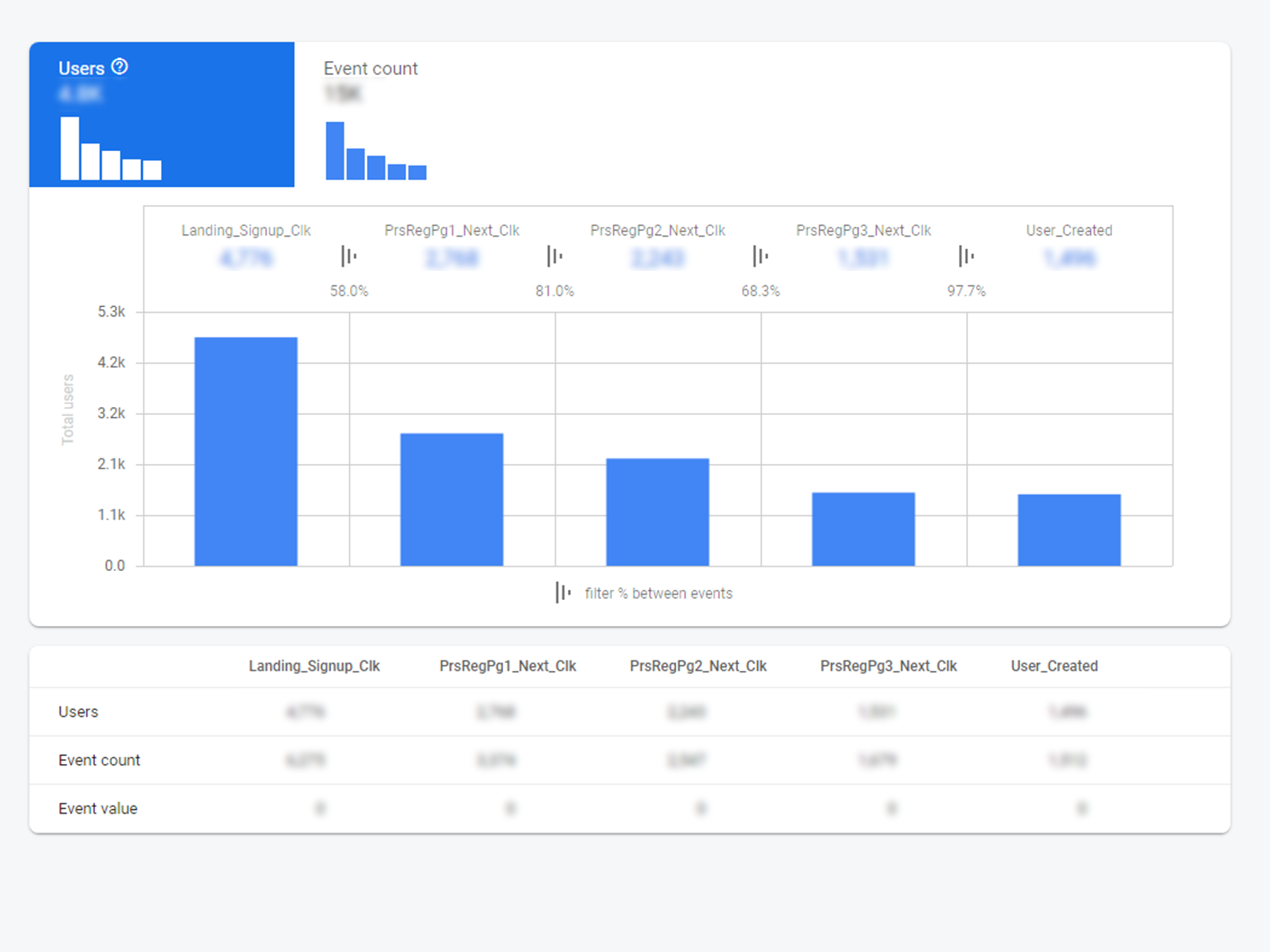
It was crucial to pick the right methods at the right time. To do so, we established the hypothesis then find a suitable testing methodology and measurements. Quantitative measurements helped us prove the hypotheses while qualitative research will reveal usability issues and the reasons behind the numbers.
Quantitative
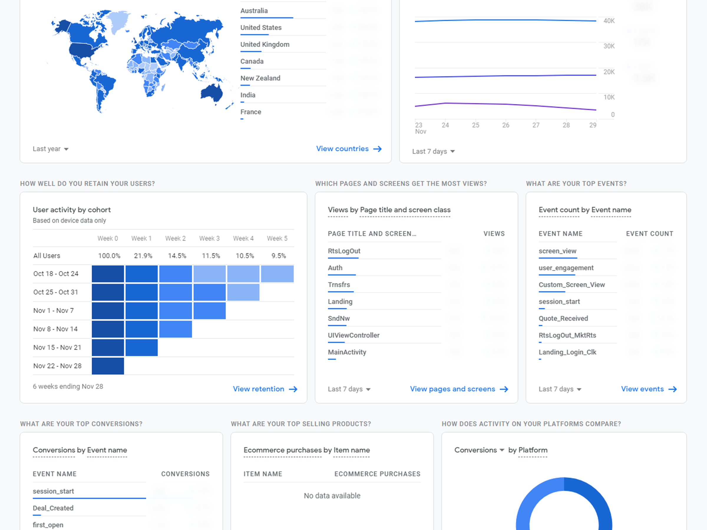
Even before the team was complete, we established the quantitative framework from the very beginning. We continued to broaden the analytics scope to help us understand user behaviours and design impacts.
Qualitative
As for qualitative research, we always performed evaluative research activities such as:
- think-aloud testing or cognitive walkthrough of prototypes
- critique sessions
- usability testing

Being Thorough Yet Practical
It is also okay to make educated guesses and assumptions when time and resources are scarce, as long as these decisions are monitored and validated later. Despite that, we always maintain one rule:
A new feature would never go into build unless it has been user-tested and validated.
Releasing & Receiving Feedback Early
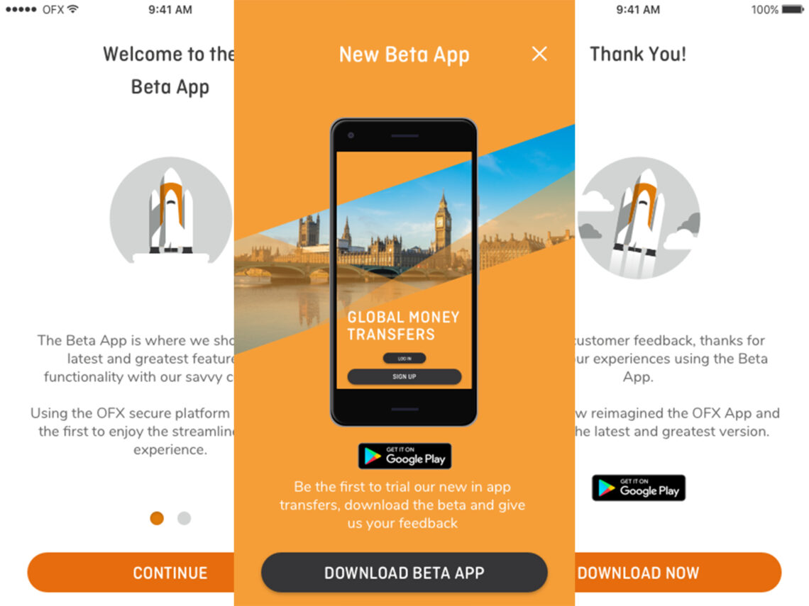
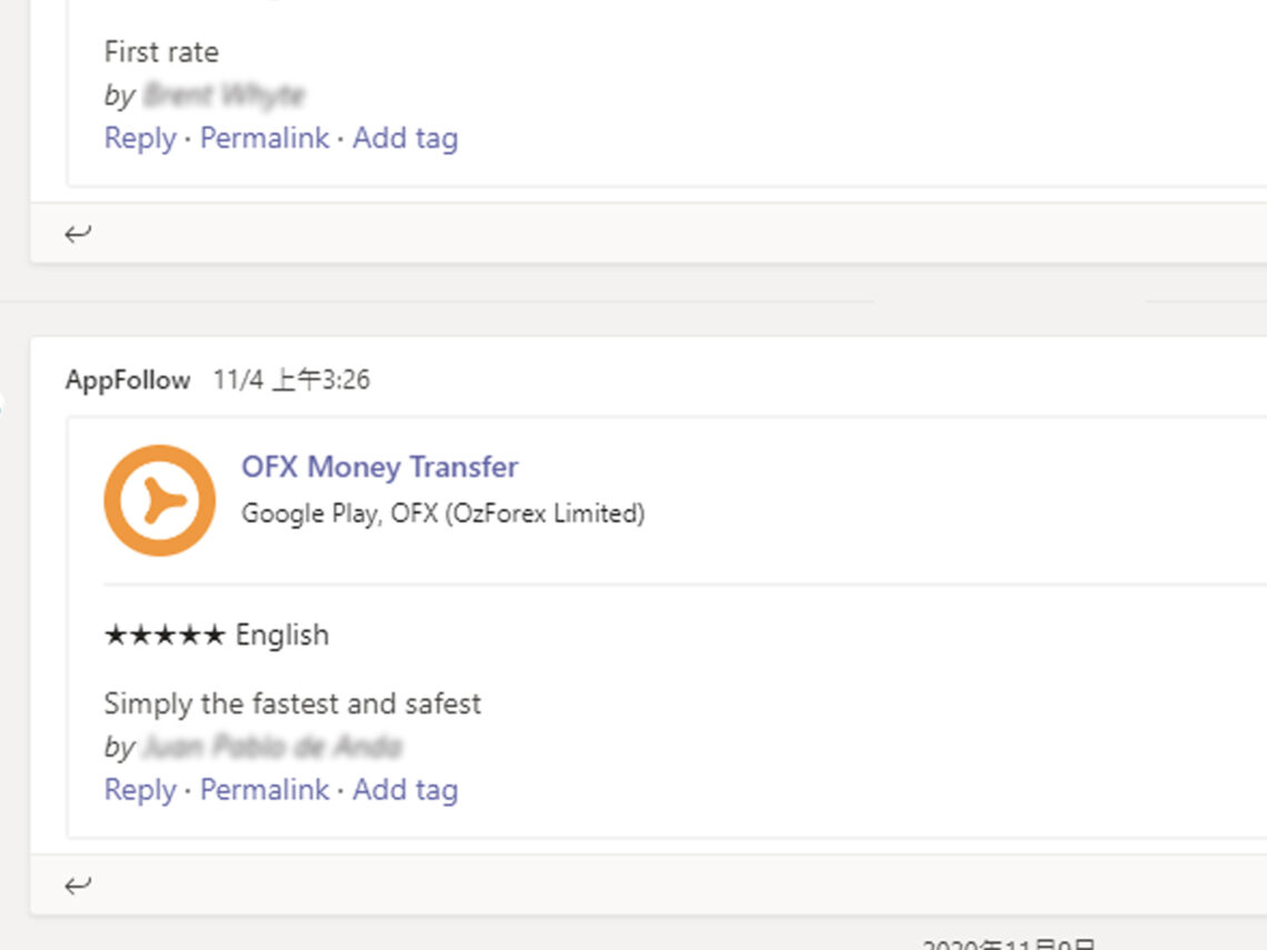
Like the Lean Startup methodology, we wanted to release the app early and learn as soon as possible. A beta app was born and released internally first, then into a specific customer cohort in the wild. The early feedback allowed us to capture critical issues and apply fixes before the main release. The positive words from the actual customers also act as catalysts for team motivation.
Customer Journey Map
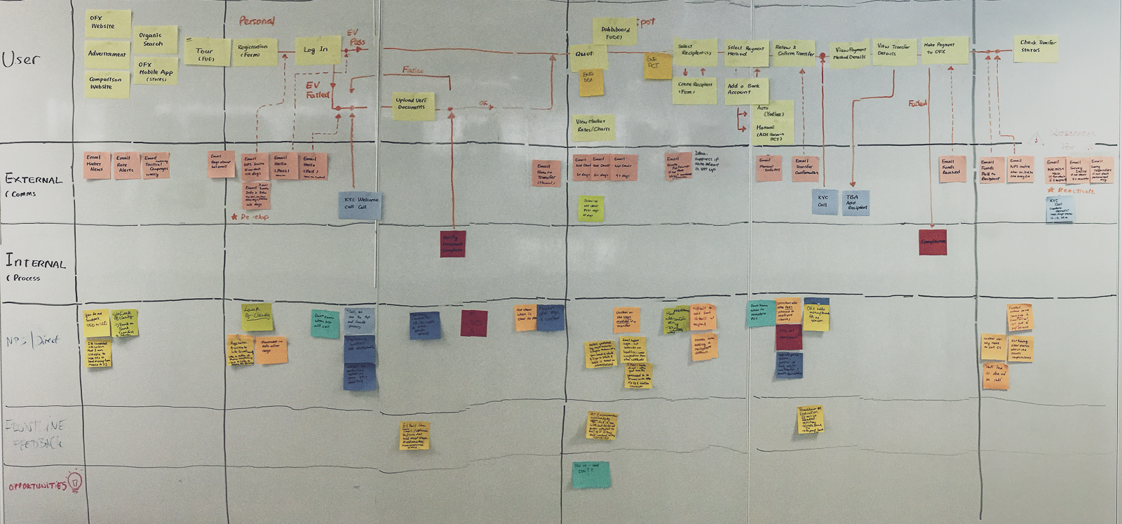
We created a live customer journey map to identify process gaps. This map also reminds us the product involves other aspects of the business such as Customer Services, Operations, Compliance and other functions.
User Interface and Visual Design
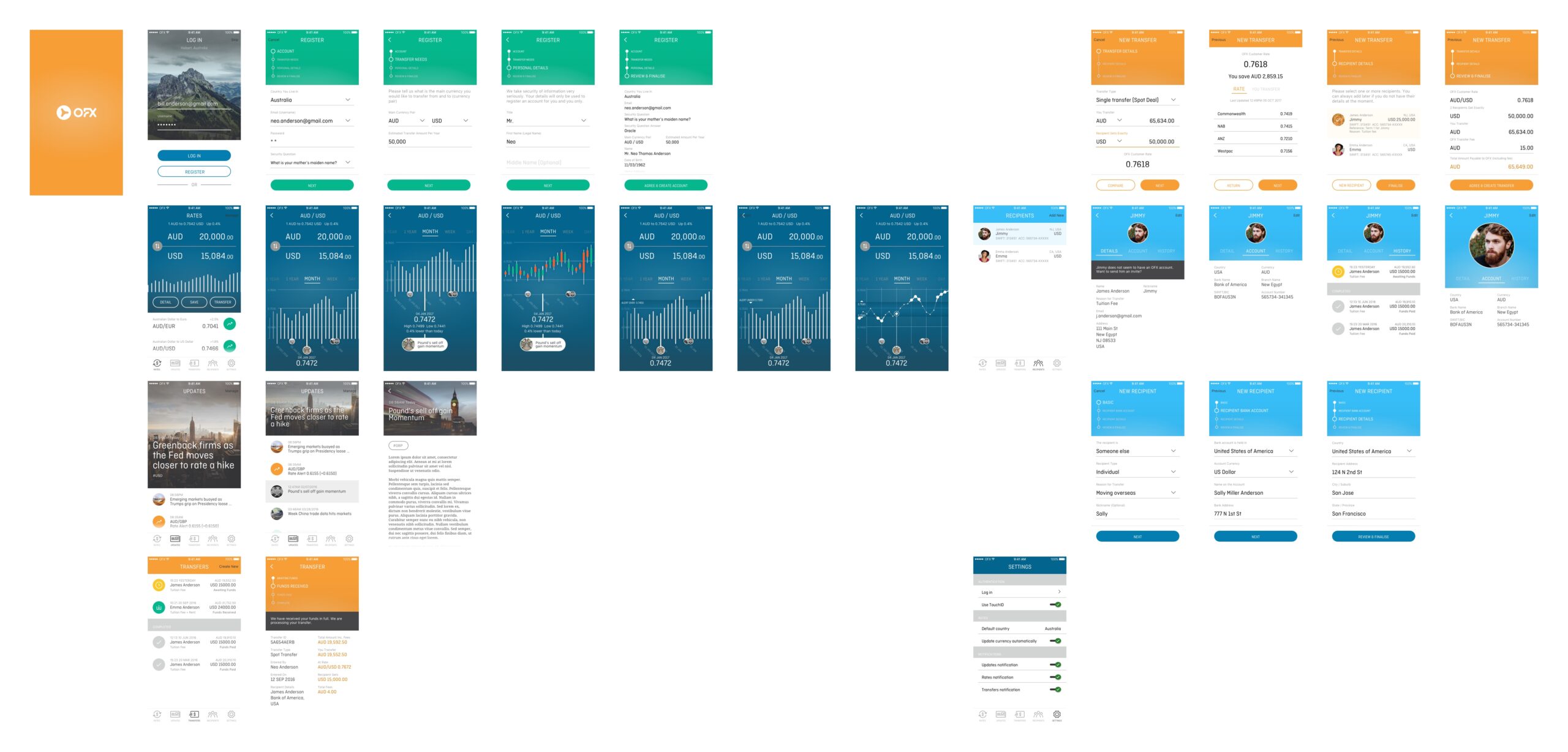
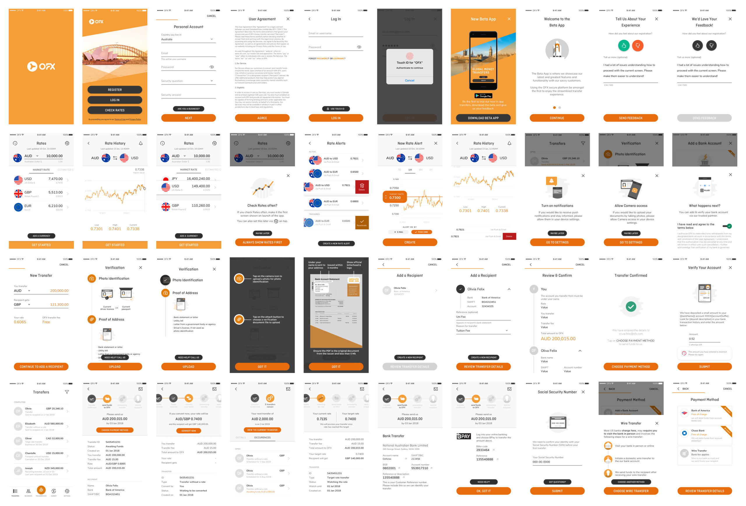
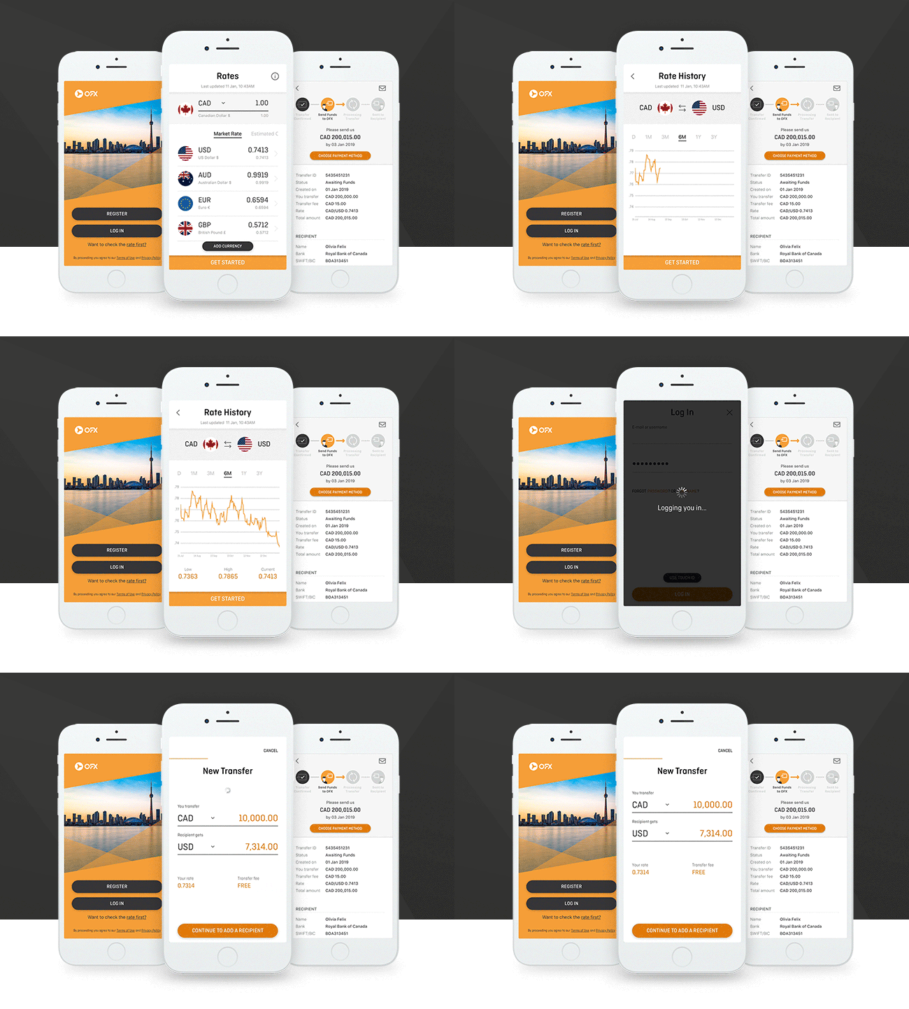
As the sole designer for the Mobile App Team, a large portion of my experience design responsibility is the user interface design. These include establishing a mini design language system with a component library, interaction paradigms, iconography, illustrations and animations.
Being Global
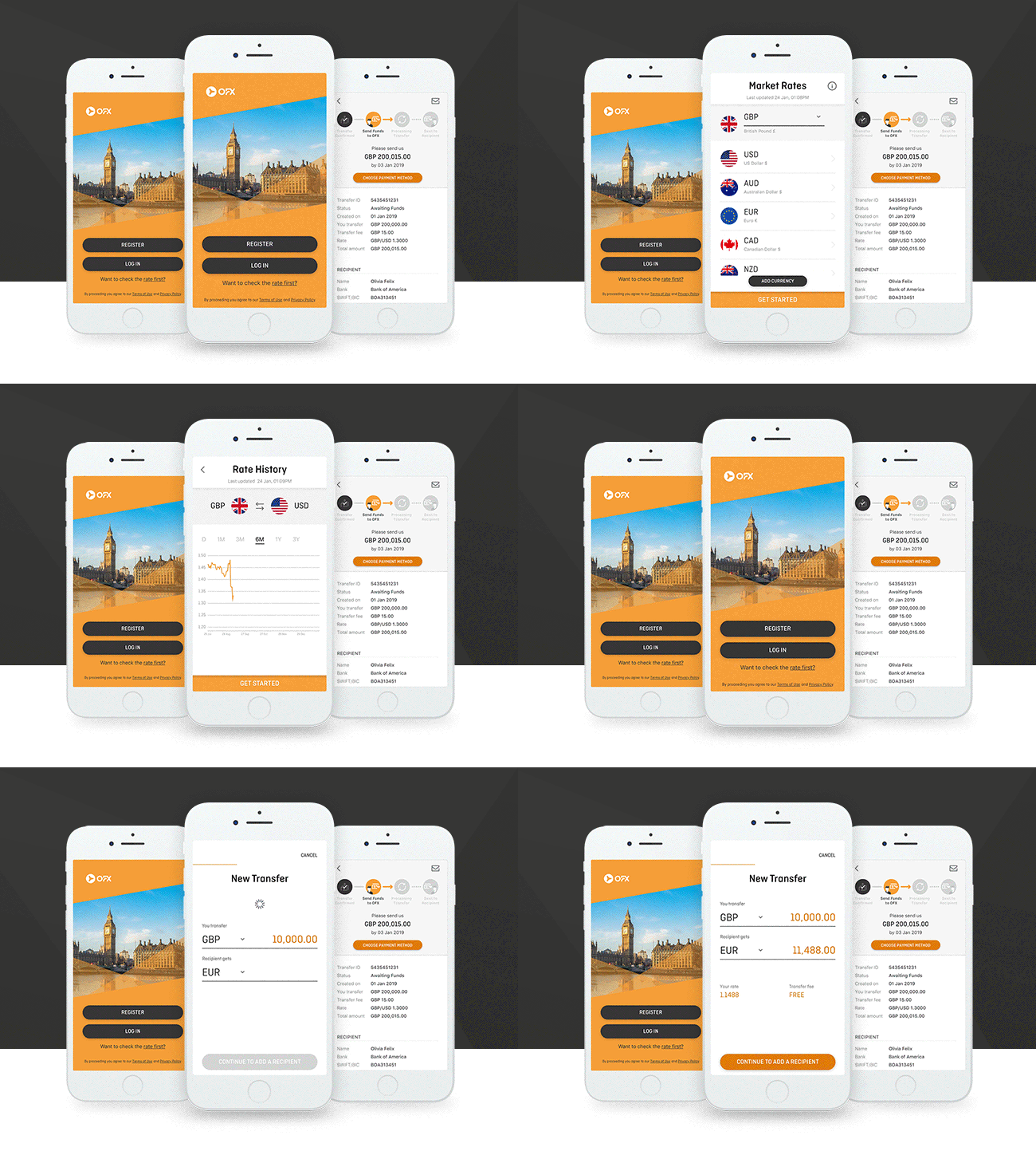
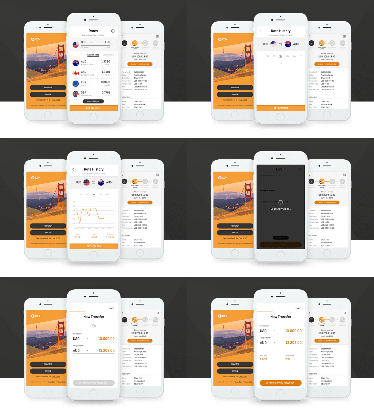
OFX offices are situated worldwide, so are our customers. Before the Mobile App, it was common for products to fall into the trap of designing for one location then retrofit for the others in the organisation. We changed that mentality and always considered other geographies. We usability tested prototypes in offices such as the United States and the United Kingdom to optimise the localised experience. We also tailored communications to fit global audiences.
Outcomes
Highlights
- Registration completion rate increased by 200%
in 6 months after launch- Transfers made in the App increased by almost 50%
in the United States in 6 months- Rated 4.8 stars in Apple App Store
and 4.4 stars in Google Play Stores
What We Learned
- It is crucial to establish measurements and baselines from the start to show business values and product evolutions. Update frequently, measure relentlessly, improve continuously were the keys to the success of the product.
- Similar to the idea of an OKR, setting a clear and motivating product vision can invigorate the team and focus on the right things.
- Building a great team culture with both excellent product & development experience can create a positive feedback loop and surface benefits in the product. It was an absolute joy to be able to work with an open-minded team that accepted a design engineer (a designer who can also code), looked at possibilities rather than constraints, were customer-centric and delivery-focused.
- Considering our customer demographics, we should have built more accessibility and internationalisation features.