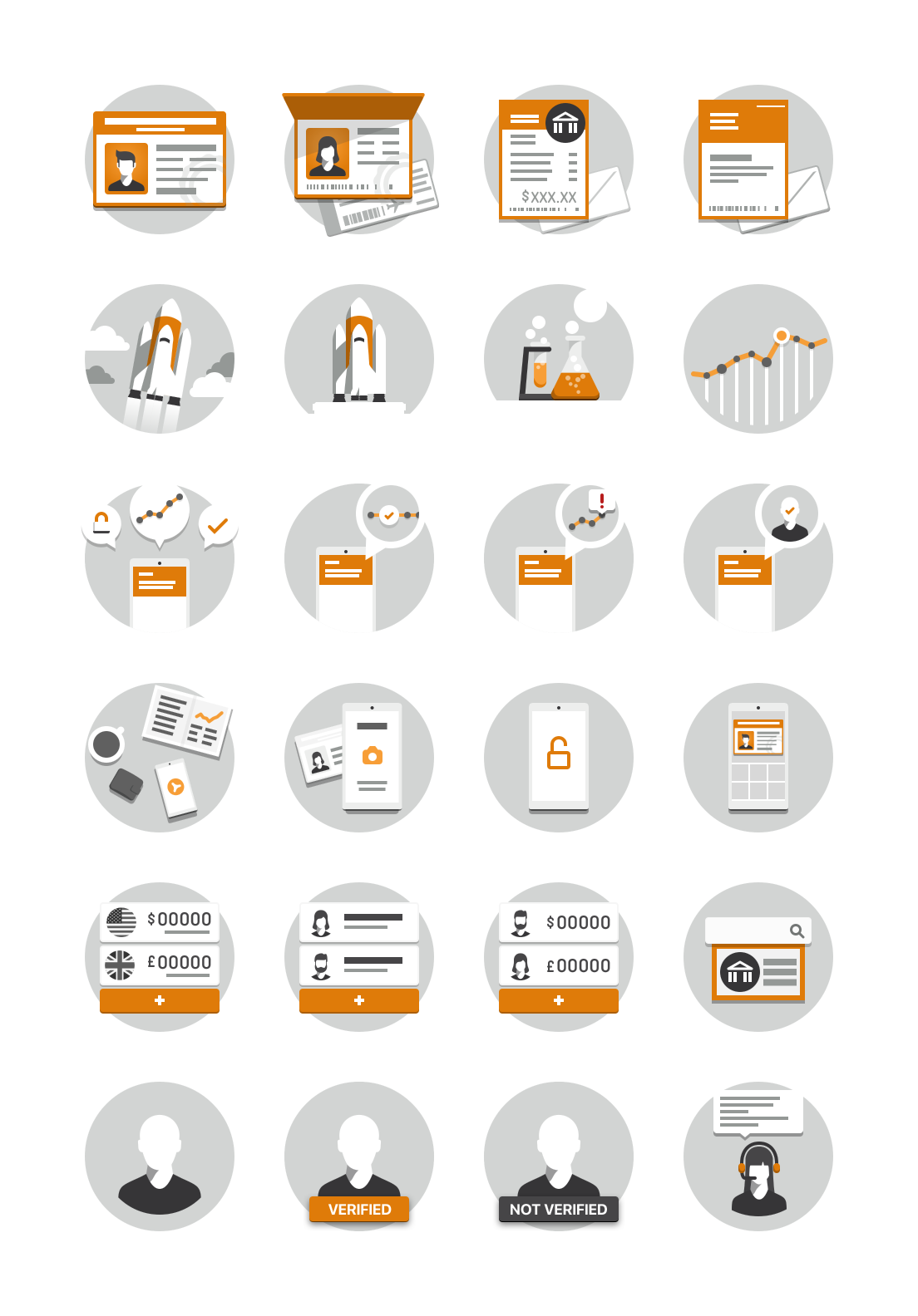
OFX Illustrations
Background
In 2016, OFX was rebuilding its Mobile App from the ground up. The new Mobile App needed modern and functional illustrations to complement its new minimalist user interface designs. I created the following illustrations for the App as well as setting a foundation. These illustrations were version one of the illustration tokens in the FOX Design Language System.
Philosophy
The illustrations are monochromatic in colours with hints of the brand orange and charcoal grey. The saturated orange was used in key parts to convey an idea, an action or something requiring attention.
There were common shapes and elements across multiple illustrations such as people, phones and speech bubbles to ensure the illustrations were bound together as a family. The illustrations were pixel-aligned to perfection to ensure they were sharp and crisp even when displayed in low pixel density environments.
To make the shapes and forms more interesting, subtle shadows were introduced to create subtle elevations separating elements and improving visual recognition.


